Creating an efficient plot of Wind using Mapbox GL JS


Abstract
Mapbox GL JS is a client-side JavaScript library for building web maps and web applications with Mapbox's modern mapping technology. To plot huge CSV datasets of wind data on a World Map, using graphical notations like wind barbs, we utilised various functions and clustering mechanism of the Mapbox GL JS library.
Background and Problem Statement
Huge Dataset to be displayed on map
Multiple custom icons to be used
Displaying wind barbs as vectors
Solution Details
After analysing our problem statement and challenges, we followed a step by step approach to achieve the required plot. We split the solution into the following three parts-
- Import multiple custom icons by adding it on the map object
- Plot a Symbol layer such that each wind barb plots as per its magnitude
- Decluttering the icons such that a clean view of the data is available
Code/Implementation Steps
-
Defining an Initial Schema
Mapbox provides support for plotting a GeoJSON layer on the map. GeoJSON is a format for encoding a variety of geographic data structures. GeoJSON supports the multiple geometry types like Point, LineString, Polygon, MultiPoint, MultiLineString, and MultiPolygon. Geometric objects with additional properties are Feature objects. Sets of features are contained by FeatureCollection objects. We parsed the CSV dataset and converted it to a GeoJSON object such that each feature in the JSON was of type Point. We also attached direction and speed as properties to every feature.
let geojsonData =
{
 "type": "FeatureCollection",
 "features": [
                 {
                     "type": "Feature",
                     "properties": {
                                     "direction": 153.43495178222656,
                                     "magnitude": 0.3
                                 },
                     "geometry": {
                                  "type": "Point",
                     "coordinates": [
                                     102,
                                     4
                                 ]
                     }
                  },
                 ..........
             ]
 }
-
Import multiple custom icons
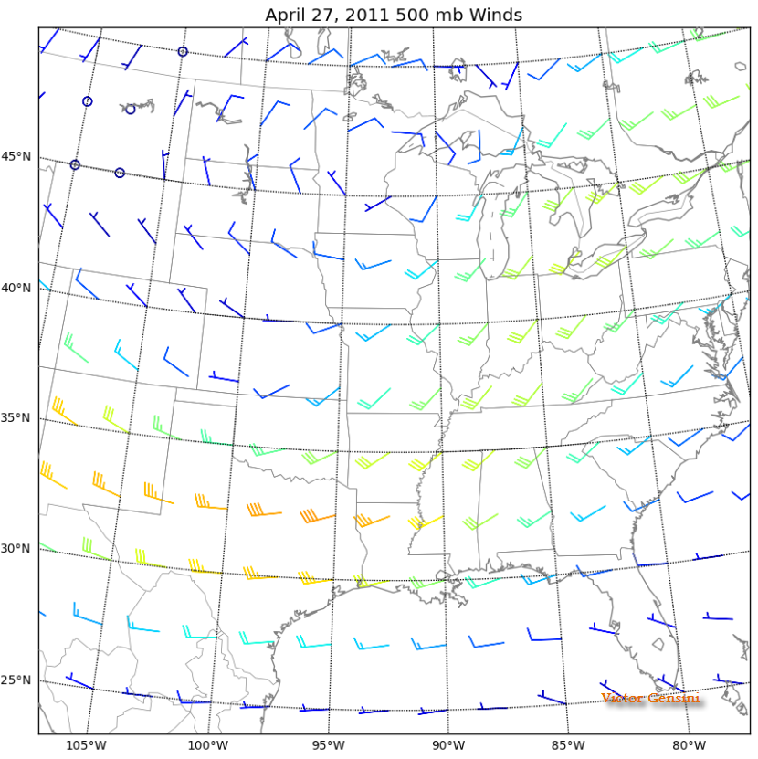
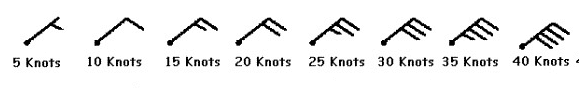
Mapbox provides loadImage and addImage functions to add custom images and icons to the map. We added each of the following PNG images of wind barbs ranging from 5 knots to 40 knots to the map. One long barb is used to indicate every 10 knots with the short barb representing 5 knots.
-
Plotting Symbol layer for Wind Data
The symbol layer is a layer in which icons or text are added to the Mapbox map. To plot an icon, multiple layout properties can be configured for setting their size, positioning, and appearance. To change the icons based on the speed of each data point, we used the icon-image property along with a step expression to evaluate each magnitude and draw wind barbs accordingly.
if (map) {
         map.addLayer({
           id: "wind",
           type: "symbol",
           source: "wind",
           layout: {
             "icon-image": [
               "step",
               ["get", "magnitude"],
               "wind5",
               10,
               "wind10",
               15,
               "wind15",
               20,
               "wind20",
               25,
               "wind25",
               30,
               "wind30",
               35,
               "wind35",
               40,
               "wind40",
             ],
             "icon-size": 0.35 + (5 / 100) * 5,
             "icon-rotate": ["get", "direction"],
             "icon-anchor": "top",
             "icon-rotation-alignment": "map",
           },
           paint: {
             "icon-color": "black",
           },
         });
       }
-
Using Clustering Properties to Declutter our map
Our final challenge was to make the map look clean at every zoom level. Clustering is a feature provided by Mapbox in which the points drawn on the map get grouped into fewer points when the map is zoomed out. On zooming in, once we cross the max zoom level set for clustering, we can view the actual points plotted according to our dataset. By clustering the points together you can improve performance greatly while presenting the data with more clarity.
For achieving this, we have to enable the cluster property while adding our source. Some important properties are:
- clusterMaxZoom: It lets us decide the max zoom level till which clustering is visible. Defaults to one zoom less than max zoom (so that at the last zoom features are not clustered).
- clusterRadius: It is used to set the radius of each cluster and defaults to 50. A value of 512 indicates a radius equal to the width of a tile.
- clusterProperties: This object defines custom properties on the generated clusters which are used for aggregating values from clustered points.
 map.addSource("wind", {
           type: "geojson",
           data: geojsonData,
           cluster: true,
           clusterMaxZoom: 7,
           clusterRadius: 30,
           clusterProperties: {
             magnitude: ["max", ["get", "magnitude"]],
             direction: ["min", ["get", "direction"]],
           },
         });
In the clip below, we can see that at the change of every zoom level, the number of barbs drawn on the map changes. When the max zoom level, in our case 7 is reached, no more clustering takes place and actual values are drawn on the map. Clustering demo
Technology Used


Conclusion
In this way, we were able to utilize some important features provided by Mapbox like adding custom images, drawing symbol layers, and clustering to create an efficient plot of wind barbs.
REFERENCES AND FURTHER READING


Blogs You Might Like